


I had difficulty with having the pictures work and line up before.
But here are the two final steps
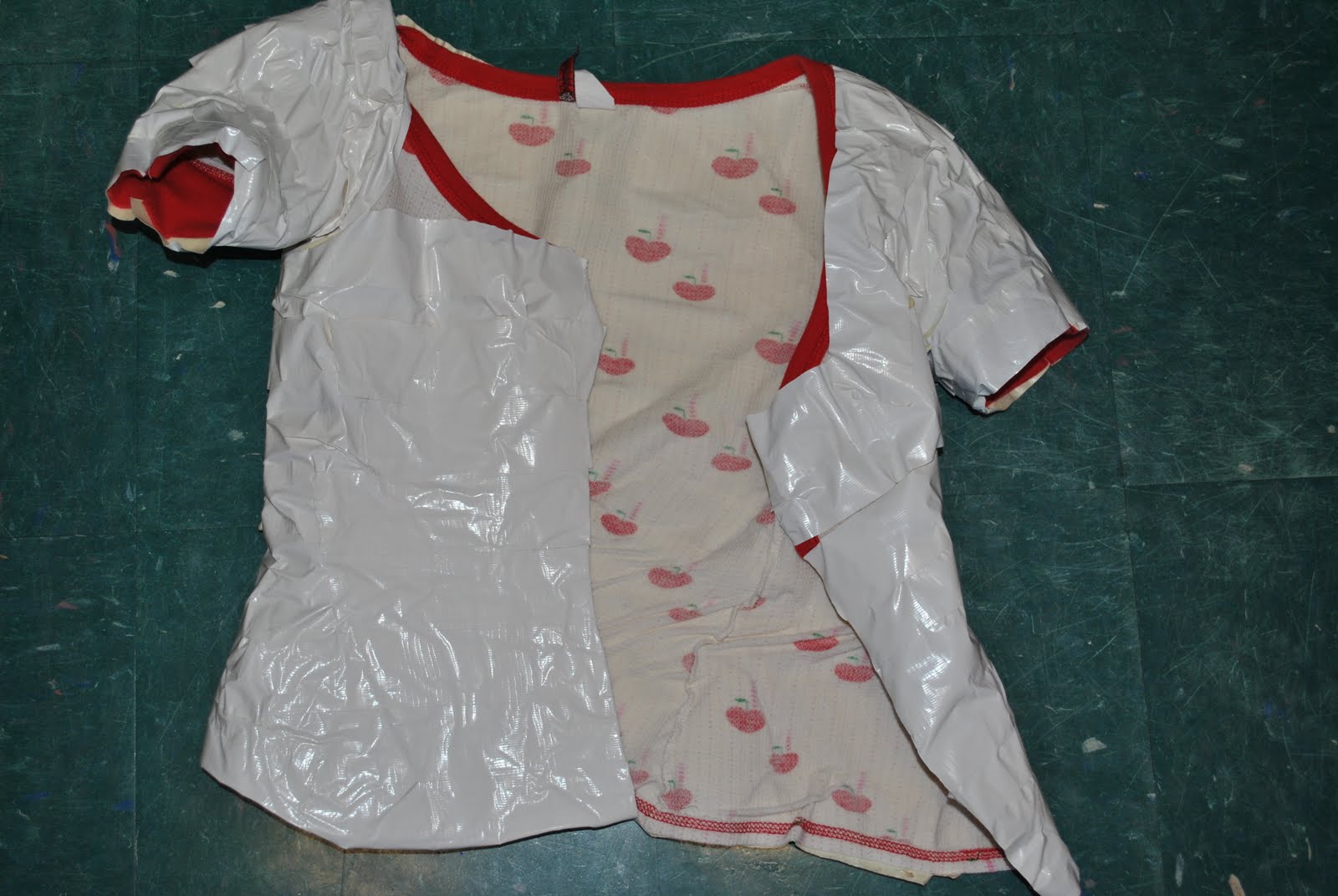


From the moment we received this project I was very excited about it as a whole. When it was stated that the piece had to be reflective I automatically took this idea literally. This is what gave me the idea to create the disco ball bra. I had tiny disco balls from the dollar store that had all of the pieces that I took off and then placed onto the bra. The only problem was that two of these did not cover the bra, which is when I faced my first design problem. Luckily instead of having to leave the bra unfinished my friend called me from a craft store and said that she had found similar mirror pieces in a slightly larger size. I used these pieces to finish the bra off. Overall I am content with the bra but those few large pieces are the one thing I would change. This piece ended up being very interesting and dynamic. Every piece isn’t symmetrical or placed perfectly but I think that is what adds to the dynamics, it creates sort of an unpredictable pattern with unpredictable reflections that create depth. Both of the pieces I’ve created represent my love for dance and music. Glam rock to be more precise, I am inspired by artists such as semi precious weapons and lady gaga, where the clothing represents a part of their presentation. It represents more than a jacket or a bra, it turns these regular items into costumes that fit their musical interest. Which is what I did with both pieces. For my second piece I wanted to create a jacket out of duct tape. Taking an old fitted shirt and wrapping it up in duct tape created the form of the jacket. After continuously layering the interior and exterior of the jacket with duct tape to make sure it was presented somewhat neatly the jacket began to shrink in size. It also lost a lot of flexibility, which lead to my second design problem of the jacket no longer fitting me. This problem created some stress because at the time it was a little to close to the deadline to start the entire jacket over again. So I decided to have someone else model the jacket. The jacket also caused me problems because I thought the entire jacket being plain white created a straightjacket look that isn’t really what I wanted to portray. I wanted to portray music, a dirty rock old school hand made clothing look. So I took black paint to it and was very pleased with the outcome. Instead of having a plain white or plain black jacket the colors and the creases of the ductape worked together to create sort of a worn and rustic look. The negative space is filled with the white duct tape that hasn’t been touched by the black paint that creates different lines traveling all over the jacket. The jacket is created by two patterns from paint and the untouched tape creases. I also wanted to tie both of these pieces together by using glass because I want to be sure that the idea of a glam rock costume be created. Unfortunately this led to another design problem that was having the glass stick to the duct tape jacket. Nothing seemed to work, even now I keep going back to check and retry different things, because every time I think I’ve found a successful solution, a day or two later the pieces are ready to fall off. But overall I wanted to put an emphasis on both of the pieces by taking simple objects and making them flashy and grungy. I wanted to create pieces you would see at an underground club or up on a stage. I wanted to create pieces that show my love for music, dance and performances. Overall I'm content with the outcome of my pieces.


 Phase A: Altered Books


Although both projects dealt with serial planes I found the altered book one to be easier. Perhaps I liked the idea of taken an item that was already known and being able to morph it into a figure that serves a completely different purpose. The book assignment gave me that ability to see what I can create if I peeled away and carved at bits and pieces where as the white serial planes I was given the materials and told to build the structure instead of altering it. Maya Lin says she has art at like a catalyst. I believe this after looking at the structures she has created, from a carved book to the Vietnam memorial. I tried to have her works inspire me by using very simple ideas to create works that are expanded or stretched.
The altered book I created was cut in the shape of an anatomical heart. But once the book was open and the pages were spread the figure of the heart was lost and instead you are able to see the negative space formed by cutting away pieces of the pages. And these spaces formed what almost looks like a shell, when it is placed properly as a table piece. I enjoyed this project a lot, I felt like the taking away from the book and being able to create something new was quite refreshing and even a little relaxing. While other’s had difficulty with this project I would have to say it was one of my favorites. Not even because I enjoy the outcome, but more so I enjoyed the process.
The white serial planes were a lot more difficult for me to work with. I had ideas and inspiration from a wide range of things including the Australian opera house, bmx and skateboarding ramps from other countries to buildings in general. I wanted to create a structure that had two different sides to it. One side of my piece shows the inspiration from the ramps with thin strips of planes twisting and turning to show movement crawling from one of the sides to the top. While the other side shows the inverse of the figure and the inner workings, I used the glue from my glue gun as a tool and had it become a part of the piece. I wanted this side to look as if it had been pulled apart and the other as if it was being stretched out. The piece was considered abstract the whole time, compared to the book where at times could be considered representational. I also allowed there to be space in between each plane so that it will add height and the space in-between will create a shadow that shows depth.
I thought both of the projects were very helpful for me to ease my way into working in 3D. I did have more trouble portraying the ideas in my head and sketches for the white serial planes. But I think if I mapped it out better and did some math behind it, the structures could have been completed and the end result would have been more true to the sketches. I thought the altered book project is something that like Maya Lin I got inspiration from and could see myself doing it again.
"An artist's only concern is to shoot for some kind of perfection, and on his own terms, not anyone else's."- J.D Salinger
“Art is what you can get away with”- Andy Warhol
Both of these quotes define my interest in art and my views on creativity. I believe that being creative is being able to express yourself in any type of outlet, whether it is drawing, painting, writing, dancing if you can successfully portray the emotions you are feeling, I believe that is what makes someone creative. Creativity is focused a lot on emotions for me; it is a link that allows someone to express their emotions through being creative. Also creativity is being able to look at a problem and come up with a solution that may be different from the typical response. I chose these two quotes to represent what creativity means to me because when J.D Salinger says, “An artist's only concern is to shoot for some kind of perfection, and on his own terms, not anyone else's." It shows that creativity is also for yourself and relates to your emotions, and it doesn’t really matter if others don’t understand your view of the solution what matters is that you were able to express what you wanted. I also chose “Art is what you can get away with” because when Andy Warhol said this I think he was describing how art is a creative solution to solving any sort of problem. It is what allows you to be creative and express yourself and not have answers that are truly outside the box. This is also why I have chosen a creative career path, because I can sit at a desk and you be fed information all day, but it would never process the same as it would for someone who is majoring in math for instance. My thought process is in images, not numbers, maybe occasionally words, but mostly images. All of my emotions or ideas are just images in my mind, and a creative career is what will help me display them best. When given this assignment my ideas all began before I had chosen my box. I wanted to create something abstract but geometric, something that from a distance appears as simple but has complex details. Keeping the geometric feel of a box but switching shapes and adding small complex details, while creating something abstract instead of representational. So while I was sketching I kept thinking of triangles and creating pyramids to make them 3D. Unfortunately at the time all I could find was a special K box. This box was a lot smaller than I had imagined it also didn’t have the same texture I was looking for. So I decided to keep the color on the outside of the shapes to keep the texture. Which in the end I think became the downfall because it made the piece look cluttered and way to chaotic. Also I had to change my design around from my original sketch because of the size of the box. So instead of a series of large pyramids balancing on each other I decided to create large bases but then have small triangles travel around them. Overall I can honestly say I wasn’t very pleased with how my piece came out, I think the structure and the detail work is how I imagined it, but the texture of the box and all of the colors distract the viewer from seeing the idea I wanted to originally portray.


